The current bathroom layout leaves a lot to be desired... although being able to wash your hands while sitting on the toilet was a neat feature *sarcasm*. In some ways, delaying this project has been good because it took us this long to find a layout that would minimize space issues. We have a stack in 1 corner of the bathroom that precludes a more efficient layout with the tub across the wall with the window on it. After months of thinking about it, we've arrived at the following design.

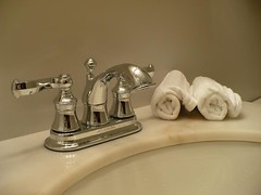
There is a bit of unused space behind the tub by the toilet. We'll put some shelves there for some extra storage. The vanity is going to be a bit small so we'll probably need the extra space. Below is the vanity we're looking at getting. It's an American Standard from Home Depot. We'll be pairing it with the same Glacier Bay faucet that we used downstairs.


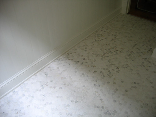
For the floor tile we're planning to use hexagon white marble tiles. The picture below is from DoorSixteen's really pretty upstairs bathroom.

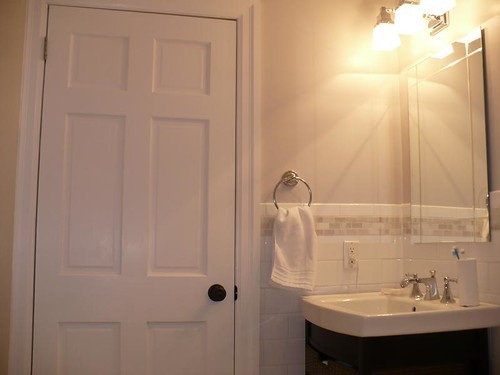
The walls will include copious amounts of our 4x8 white subway tiles, and some wayside inn grey paint (this is the same tile/color we used in the basement bathroom). We're still playing around with what to do for an accent tile (if we do one) and where exactly we'll put the tile. It's less than 2.50/sqft so we can afford to go a bit nuts :D.


2 comments:
That will look great! I can't wait to see the finished product.
Hi, nice work! What software did you use to create the layout of the washroom?
Post a Comment